Here is a frame styling lesson in 2 parts:
David picks out a zippy acetate set in blue/tortoise:
…And a thinner profile metal square-rim in green/cream:
Two contrasting frame styles that compliment his style, offer versatility, and express slightly different attitudes, but stay natural to his personality. David wins!
Customers around the Shop: Rachel P.
Creamy off-white can be a tricky color to pull off for most. Rachel is certainly the exception here- the color is a polished, yet edgy highlight to her “summery” features. Plus, this unique and uplifting shape takes her style aesthetic to another level. What a looker!
WOODn’t it be cool to wear one of these new styles?
The “wood-grain” textured look on acetate frames is certainly not dead- there’s a new crop of styles coming into the shop that suggest this aesthetic has evolved!
We are seeing this trend re-vamped with more color and integrated with metal to create dynamic designs:
 |
| One of our new collections mixes metal with faux wood-grain color |
…or departing from the heavier, chunky effect to a more tried-and-true organic look in these thinner, lighter styles:
 |
| Both classic & contemporary shapes are complemented by the earthy aesthetic of the wood-grain treatment. |
 |
| This texture pairs well with rich colors & sharp color combos |
 |
| earthy tones create that quintessential down-to-earth look |
Customers around the Shop: Aurore M.
This Eyes on Fremont collection model, “The Lusty Lady” is nothing short of perfect for Aurore’s petite face. As a bonus, the rich matte red color brings out a rosy hue in her complexion, adding to her glow!
Customers around the Shop: Laura F.
Laura’s new square-rim is a more subtle version of the “radiant orchid” Pantone color we just featured in our last post… we think the frame’s crystalline lilac tint is a perfect complement to her autumn features!
Color Inspiration: Pantone color of the Year, Radiant Orchid!
Springtime calls for something fresh & new in regard to fashionable color ways. At the moment, we are taking our inspiration cues from the design world’s most renowned authority on what’s hot color-wise: PANTONE, INC!
“Radiant Orchid” is a rich mix of both warm & cool tones that is versatile and dynamic. The hue compliments a range of color palettes and flatters most complexions… also one of those great colors for those “make-up less days,” ladies!
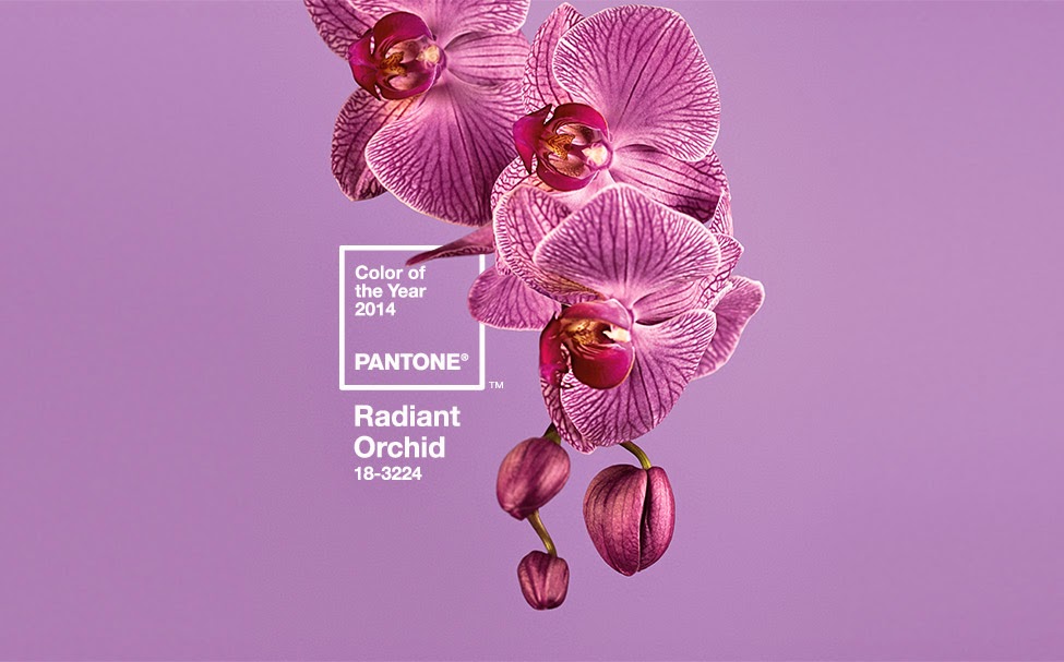 |
| Read some interesting tidbits on this “color of the year” at www.pantone.com |
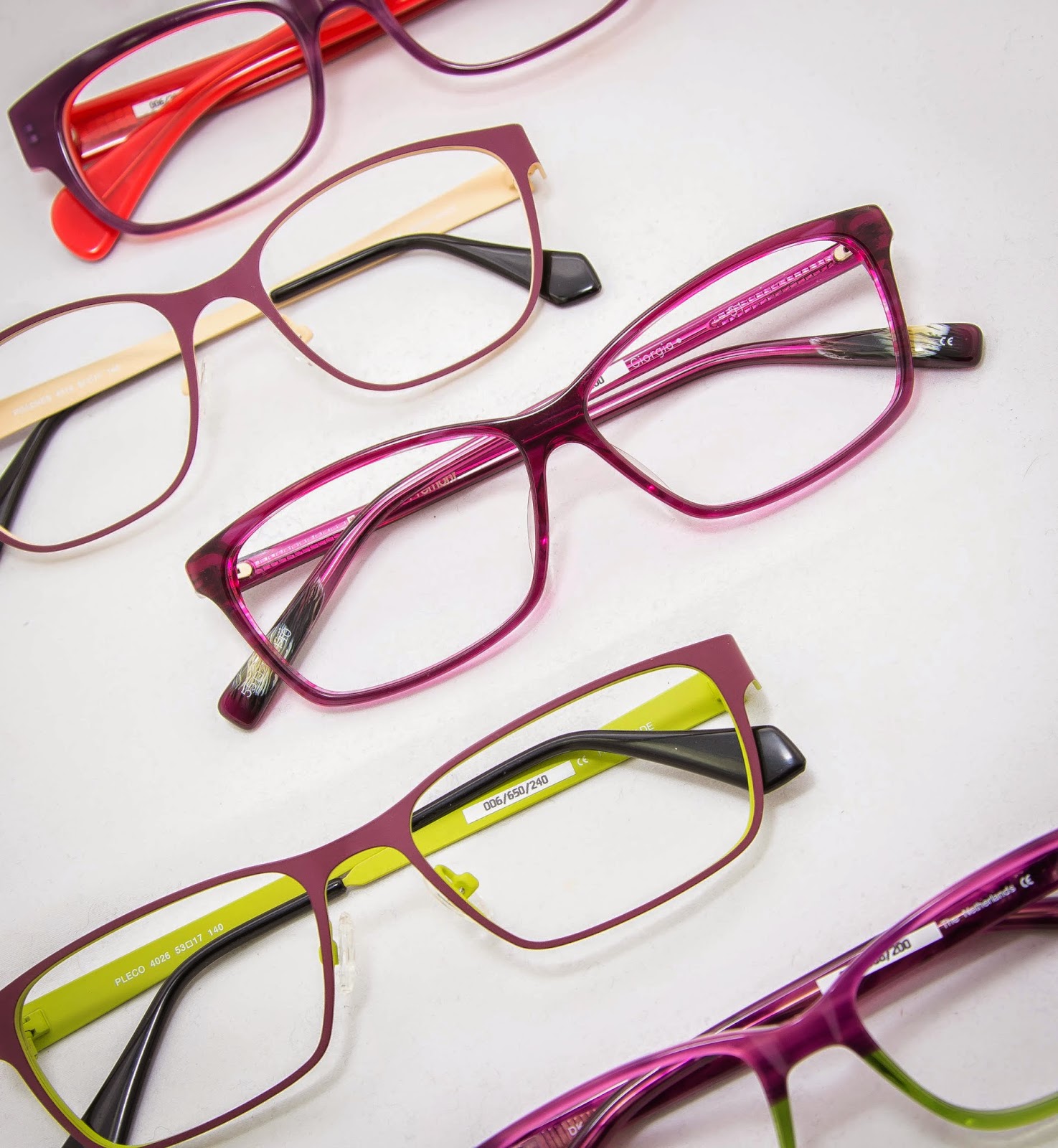
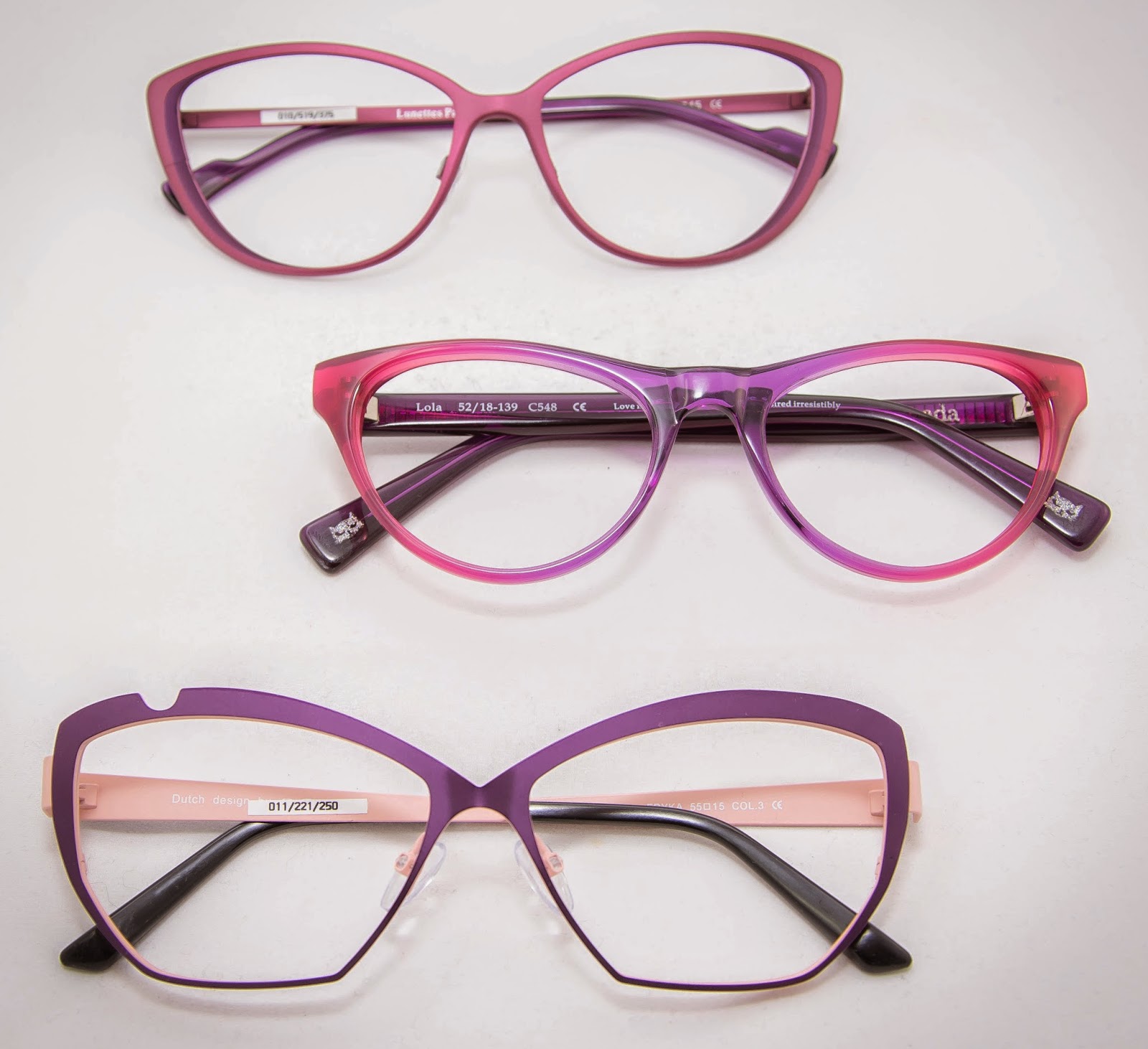
Here are some current springtime models that capture this vibrant color in a truly wearable way:
